  1. What medium did you pick and why?
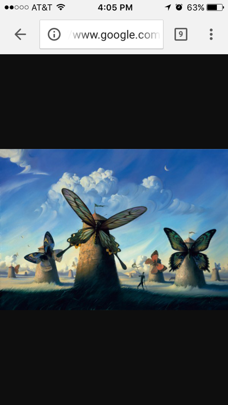
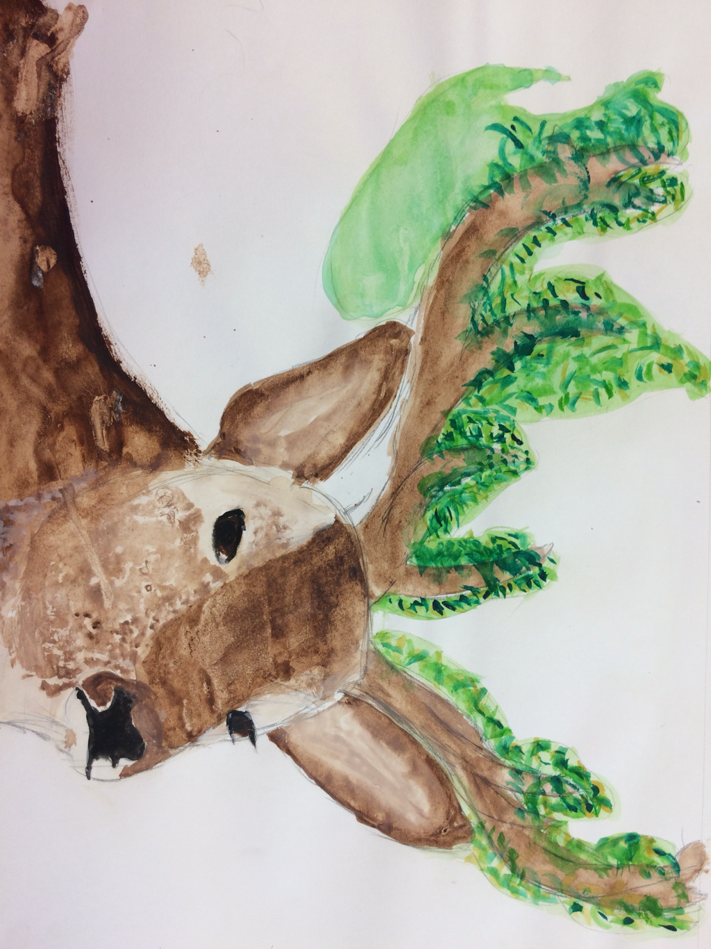
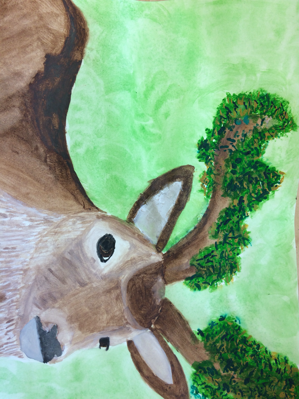
I picked watercolor because it's one of my favorite mediums and I thought it would be a great choice for my project. I wanted to paint, but I didn't want to do acrylic since I did that medium for my previous piece. 2. What did you add together to be your "two-in-one?" I added a reindeer and trees to be my two-in-one. 3. Explain your process from start to finish. When I was thinking about what I wanted to do for this project, I was looking outside. The first thing I saw were branches from my tree and I immediately thought of antlers. I found pictures of a reindeer and a tree that I wanted to combine. I did a quick sketch of it and tested the watercolor. I thought it looked good so I went on to the final draft. I began to paint from the bottom and I worked my way up. I certainly made mistakes along the way. I accidentally added green leaves at the bottom of the antler/trunk of the tree. To cover it up, I made the background green. I also forgot to paint an ear. This mistake was harder to fix, but eventually it looked just as good as the other ear. Finally, I finished the piece.
0 Comments
         1. Which medium is your favorite and why? (10pts)
My favorite medium is watercolor. I love how you can do so much with it and the different techniques you can use. 2. Which is your least favorite medium and why? (10pts) My least favorite medium is pen. It is difficult to add value to pen drawings and I don't like the fact that you can't do much with it. 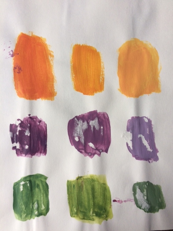 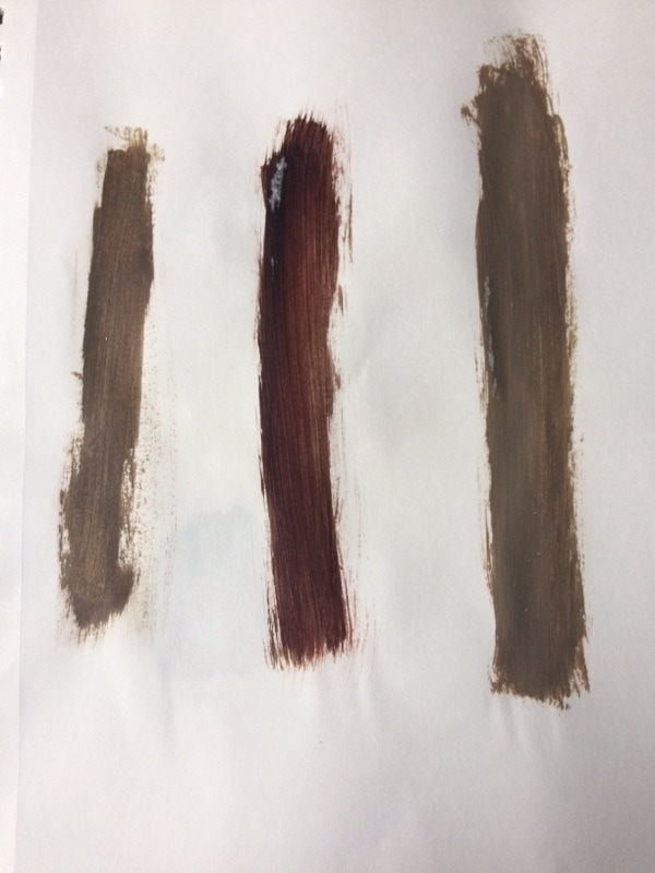   1. Was it hard to mix the color swatches? Why or why not?
It was difficult to mix the color swatches because I didn't get the right color on the first try. There were several times where I had to mix more of a color or just completely start over. You had to get the right color to match the color swatch. 2. How do you make the color brown? To make the color brown, you have to mix a primary color with its complimentary color. 3. What did you pick to paint and why? I painted a picture of drinks that I took in Costa Rica. That picture was one of my favorite pictures that I have ever taken, so I thought it would be fun to paint.  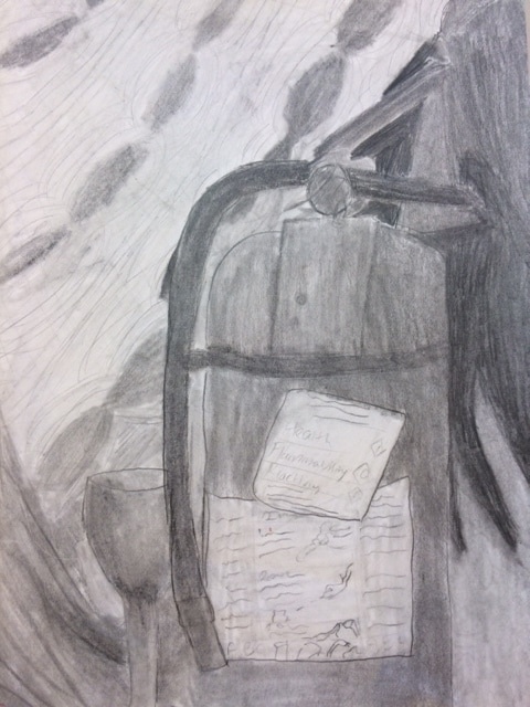    1. What warm up was the most helpful during this unit and why?
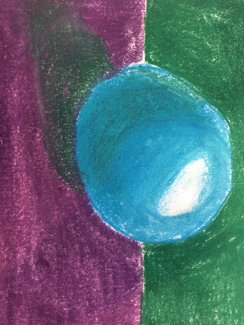
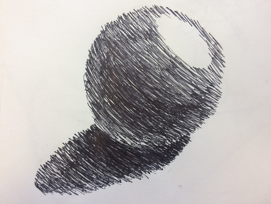
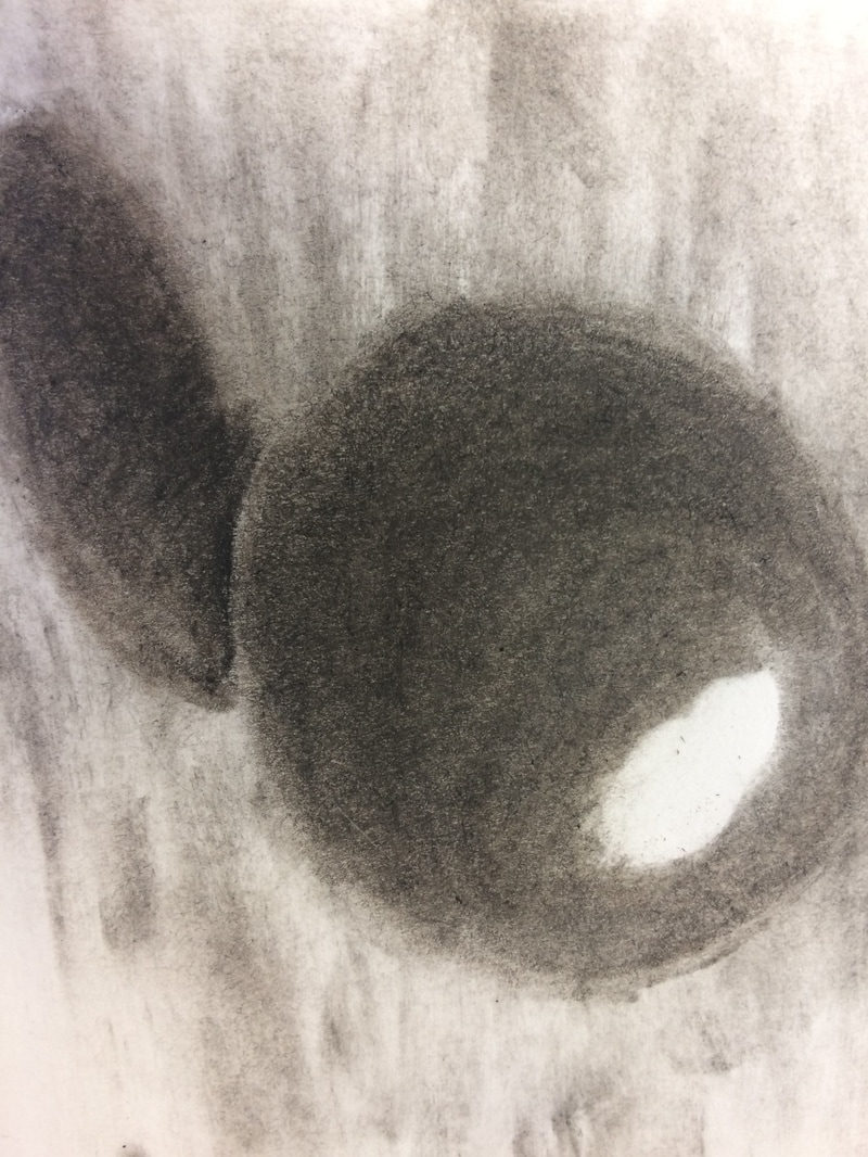
The most helpful warmup would be the upside down Picasso drawing. I could see that drawing upside down makes your work a whole lot better than just drawing right side up. I could really concentrate on the lines and where to position them when I drew upside down. 2. Define composition and value. Composition is the placement or arrangement of visual elements. It affects how the viewer's eyes will travel. Value is the element of design that defines the lights and darks in an artwork. 3. Pros and Cons of each medium (pen, charcoal, pencil) With pen, you can have bold and clear lines in your drawing. You can use various techniques such as cross-hatching and stippling to add value. However, it is difficult to shade with a pen since it only has one color: black. Pen cannot be erased. When using charcoal, you can blend easily and it is easy to change parts of your drawing if you are not satisfied with it. However, it can get messy and smudge easily which can ruin your drawing. With pencil, you can draw lots of detail in your artwork and its erasable. However, they can break easily and they need to be sharpened often. It can also smudge, depending on the hardness of the pencil. 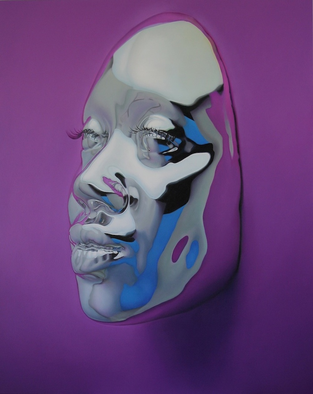 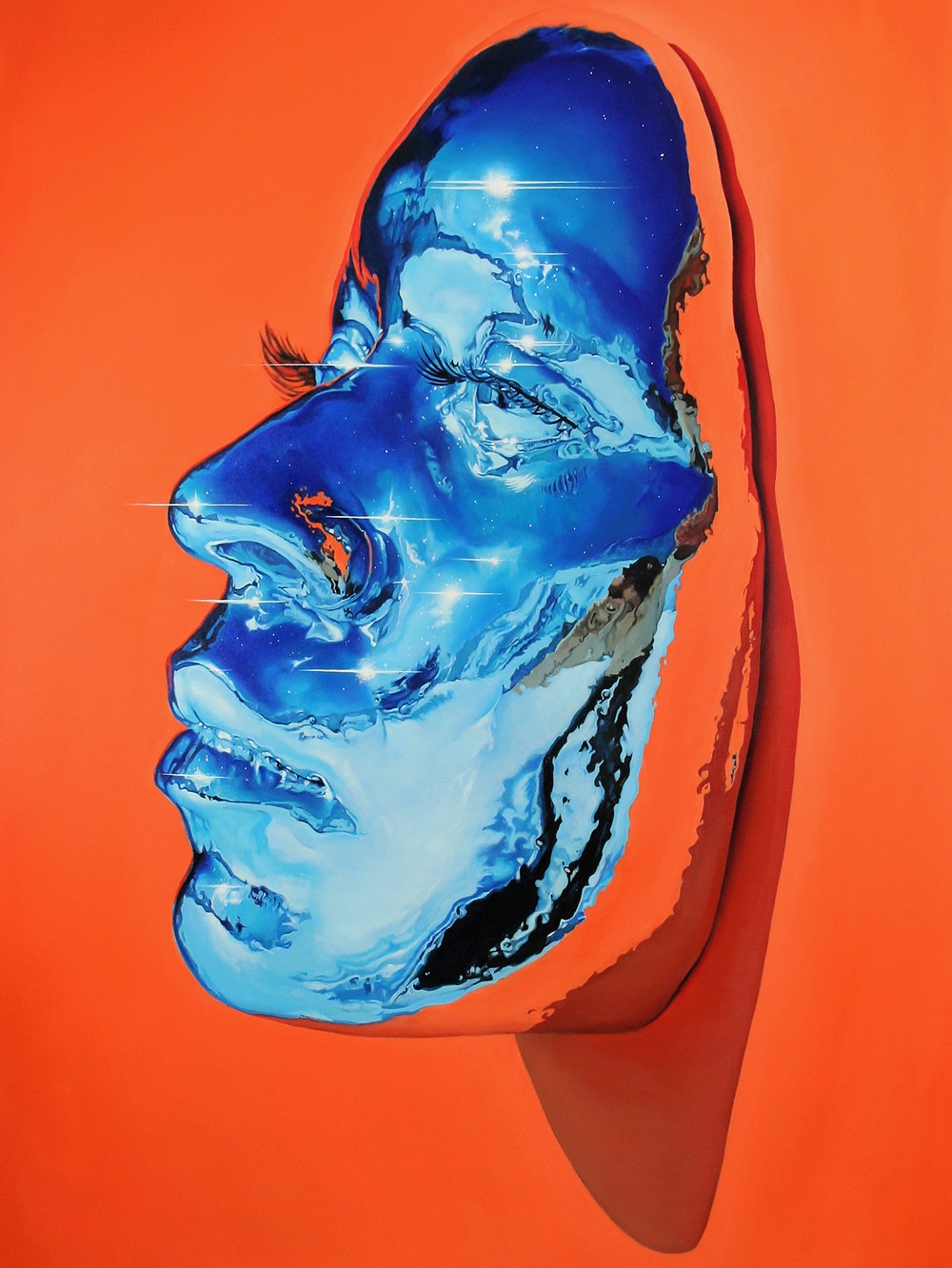 These artworks were created by Kip Omolade in Brooklyn. He works with large-scale oil paintings of masks. Omolade first began his career as an artist by working as a graffiti artist and being an intern for Marvel Comics and The Center for African Art. He obtained a BFA from the School of Visual Arts. In his paintings, he shows the subtle details of female faces and includes a reflected environment. You can see more of his work if you click on this link: http://www.kipomolade.com/.
The part that makes this work inspiring to me is the metallic look Omolade gives to his paintings. The mask in the second painting reminds me of an ocean with gentle waves and a cool breeze. I think his artwork is very beautiful to look at. The vibrant colors really draws me in. I have never seen paintings that look anything like these. I can clearly see the creativity etched within Omolade's paintings. He did a great job at making the masks look three -dimensional. The masks really pop out against the backgrounds. I am glad I came across these series of paintings because they really inspired me and made me think about how I can make my art stand out. |